hGraph:
Your health in one picture.
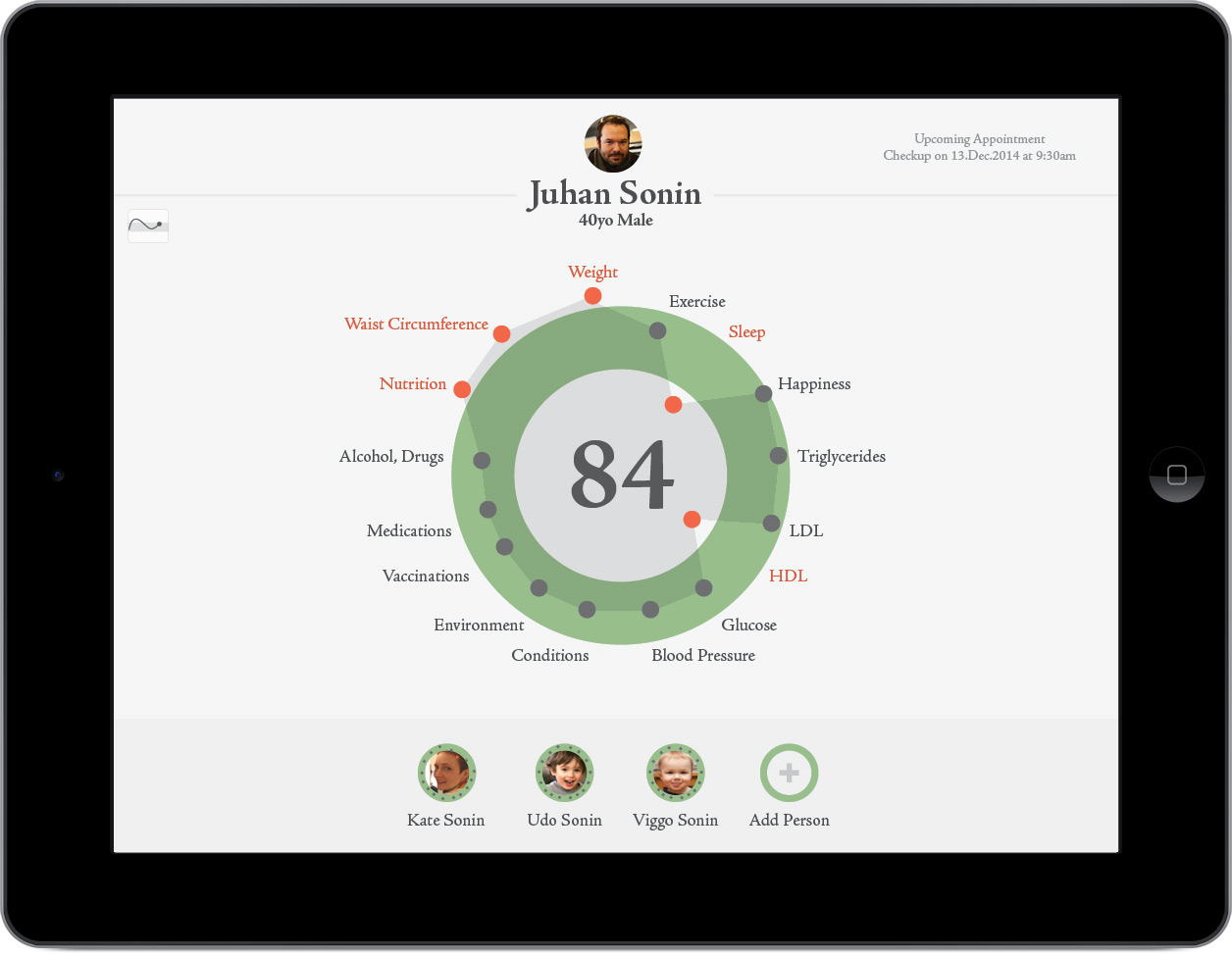
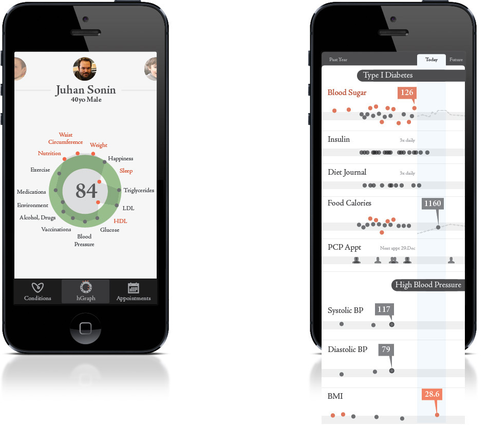
hGraph is currently the only open source tool for visualizing a patient’s complete range of health metrics. This one-of-a-kind visualization approach aggregates health data both on a personal and community level. It provides clinicians with at-a-glance analytics of a patient’s overall health, allowing doctors to spot patterns and red flags. It works by comparing a person’s health data against targeted health ranges based on factors like age and gender. Metrics that appear red are either lower or higher than the “good health” range. The hScore is an overall, aggregated score of health (1-100) that represents a person’s health status, or grade.
In this deceptively simple fashion hGraph enables the compilation and display of a considerable amount of information within a limited space. hGraph is currently in pilot programs at a major retail pharmacy and on Facebook’s campus clinic.
Growing the Big Data Trend
Healthcare data is expected to grow between 1.2 to 2.4 exabytes per year. That’s about 1,000 times the amount of data the human brain is capable of storing. This data is big, disparate and unstructured, making the extraction of useful information almost impossible. In order for patients and healthcare providers to make actionable decisions they need analytic tools that both collect data and make sense of it.
Crunching the Numbers of Analytics
According to McKinsey & Co. US healthcare costs topped $2.6 trillion in 2011 (The Big Data Revolution in US Healthcare). In the same year healthcare expenses represented 18.2% of GDP, a record high. That’s over $600 billion more than the expected benchmark for a nation of the United States’ size and wealth. They calculate early adoption of innovative tools like hGraph could help reduce the soaring cost of healthcare by $160-220 billion. Innovative, software-driven measures that target disease prevention and enable data adherence could save anywhere between $70–100 billion, while $90-110 billion could be saved by programs that coordinate care across all healthcare providers and align those providers around proven pathways.
However, those waiting for the US Healthcare system to be the leaders of change might be in for a very long wait. Business, both big and small, are quicker when it comes to seeing the need and cost-saving opportunities of hGraph.
Business Leads the Charge for Change
The hGraph project intends to change the way we manage and interact with our health, and in turn make the healthcare industry leaner, cheaper and more effective. As an open source program, hGraph has been utilized in pilot programs at a major retail pharmacy and at Facebook’s campus health clinic. These corporations lead a trend of big business improving worker productivity and their bottom lines by taking a more active roll in monitoring their employees’ health.
According to Mercer’s “Worksite Medical Clinics 2012 Survey Report” 37% of companies with more than 5,000 employees offer on-site health clinics, with an additional 15% planning to add their own health clinics in the next two years. Of these corporations 62% reported their top reason for continuing onsite health centers was because the clinics enhanced worker productivity. The second reason, according to 56% of those surveyed, was because the clinics reduced medical costs. Most corporate centers are taking a more active role in the management and coordination of employee wellness. Still, over half of organizations reported they were in need of tools to capture a holistic view of employee health to better integrate and coordinate their health programs with outside health centers.
Preventing Medical Errors
The sixth biggest cause of death in America is due to medical errors that could have been prevented. A 1999 consensus by the Institute of Medicine estimated that as many as 98,000 people die every year due to these errors. hGraph instantly shows clinicians a patient’s leading conditions, allowing them to make faster, smarter life-critical choices. Other Electronic Health Records (EHR) force doctors to hunt through dozens of screens to find pertinent information. In health, speed counts. hGraph provides medical professionals with the tools they need to save lives and improve the outcome of their patients’ health.
hGraph aims to tackle some of the largest obstacles between patients and a better understanding of overall health. Through press and awards plenty of people have noted hGraph’s aptitude. With beautifully designed visualization, hGraph provides medical professionals and patients with Big Data Analytic power that understands the context of their worlds. It is simple to use and simple to implement, which is why many have chosen hGraph as the tool to promote and disseminate better overall health.
hGraph Press & Accolades
- MITX Innovation Award Finalist, Most Insightful: Big Data and Analytics Innovations 2013
- Wired, How Restyling the Mundane Medical Record Could Improve Healthcare
- National Health Datapalooza, Featured Entrant
- Health IT Buzz, Winners of Patient Health Record Graphic Design Contest Announced
- EContent Magazine, Digital Diagnosis: A New Generation of Healthcare Technology” in EContent Magazine
- Gov Challenge: National Patient Record Redesign, Showcased Entry
- O’Reilly Strata Conference on Big Data, Featured Presentation
Pre-Diabetes shape
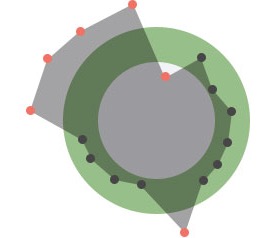
Hypertension shape
To learn about what you can do with hGraph and how you can participate in its development, contact us at hgraph@goinvo.com.