Closing the SNAP gap
A 50% increase in digital applications means more people are getting the food they need.
No one should have to worry about affording their next meal in the 21st century.
Beyond the impact to our immediate health, the psychological impacts of chronic stress of poverty have detrimental long term effects. Tragically, one out of ten of our households in Massachusetts is 'food insecure' (as reported by Project Bread).
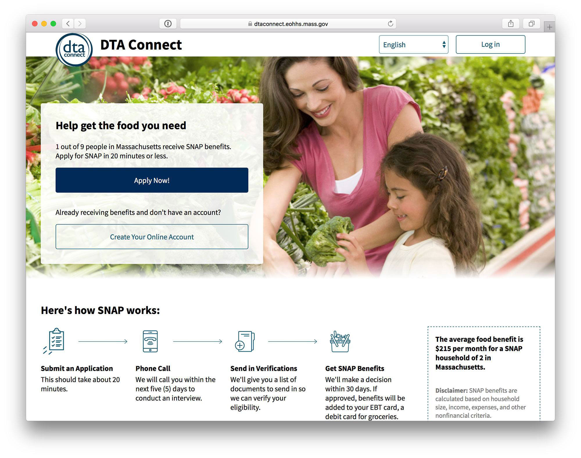
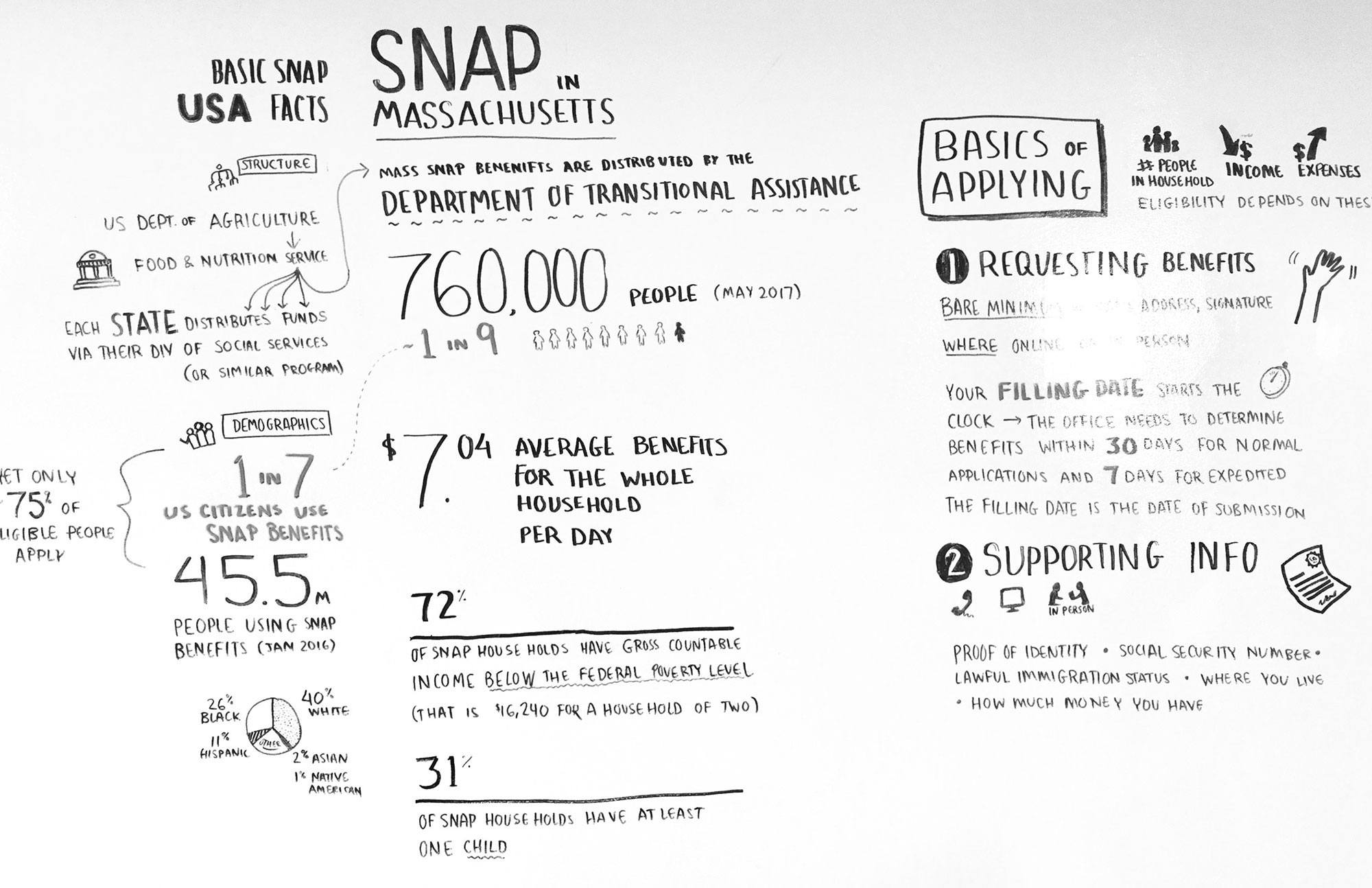
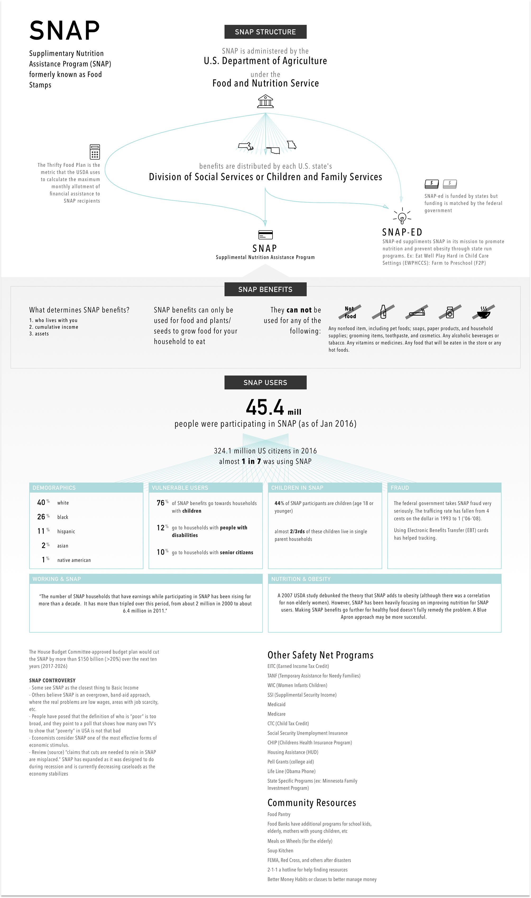
The United States government provides help during tough financial times. In Massachusetts, the Department of Transitional Assistance (DTA) helps nearly 800K MA residents afford food every month through a program called SNAP (Supplemental Nutrition Assistance Program). SNAP, formerly known as Food Stamps, is able to provide households with anywhere from $15 to $352 per month, and the DTA reports that "every dollar in new SNAP benefits results in $1.80 in total economic activity."
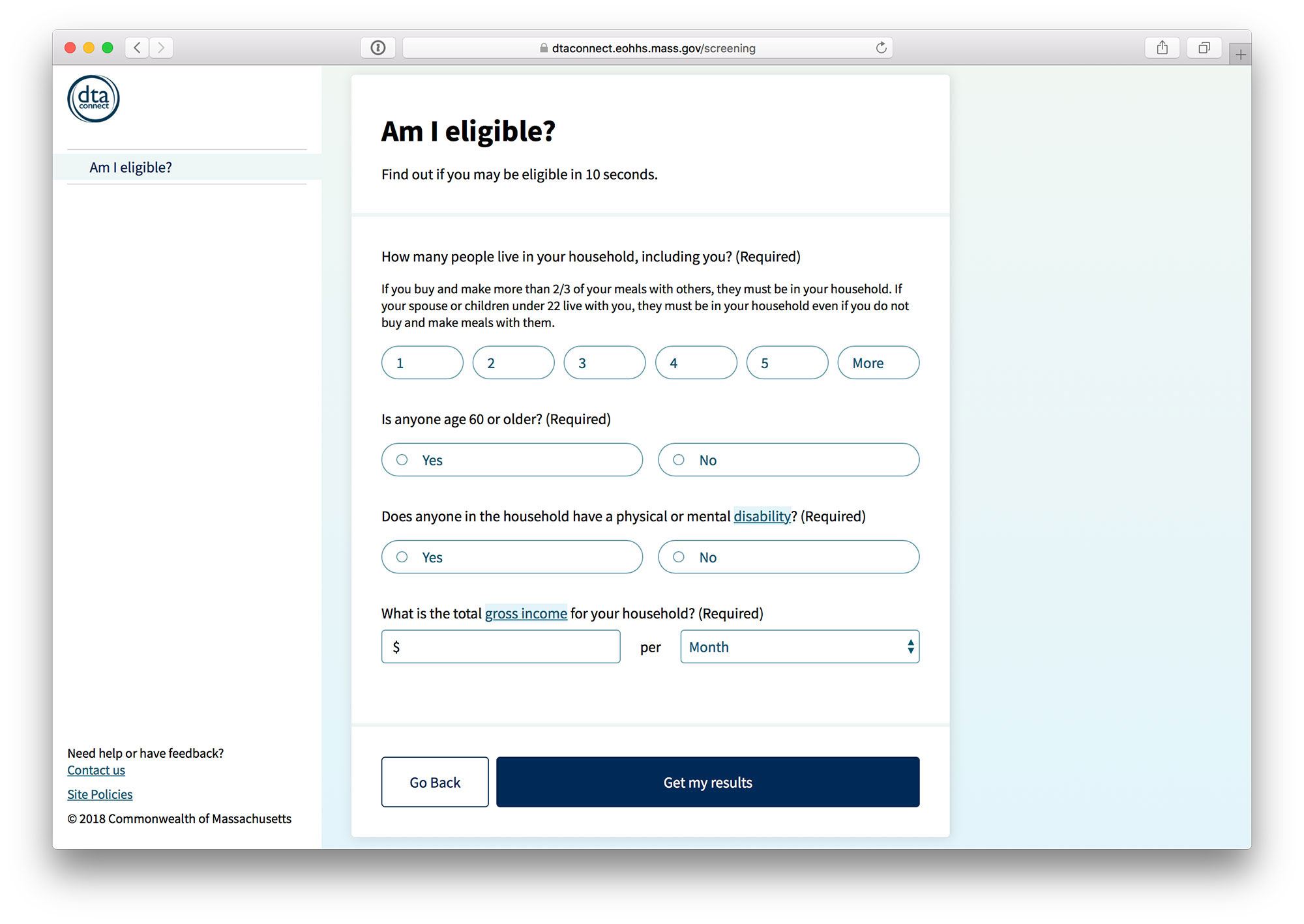
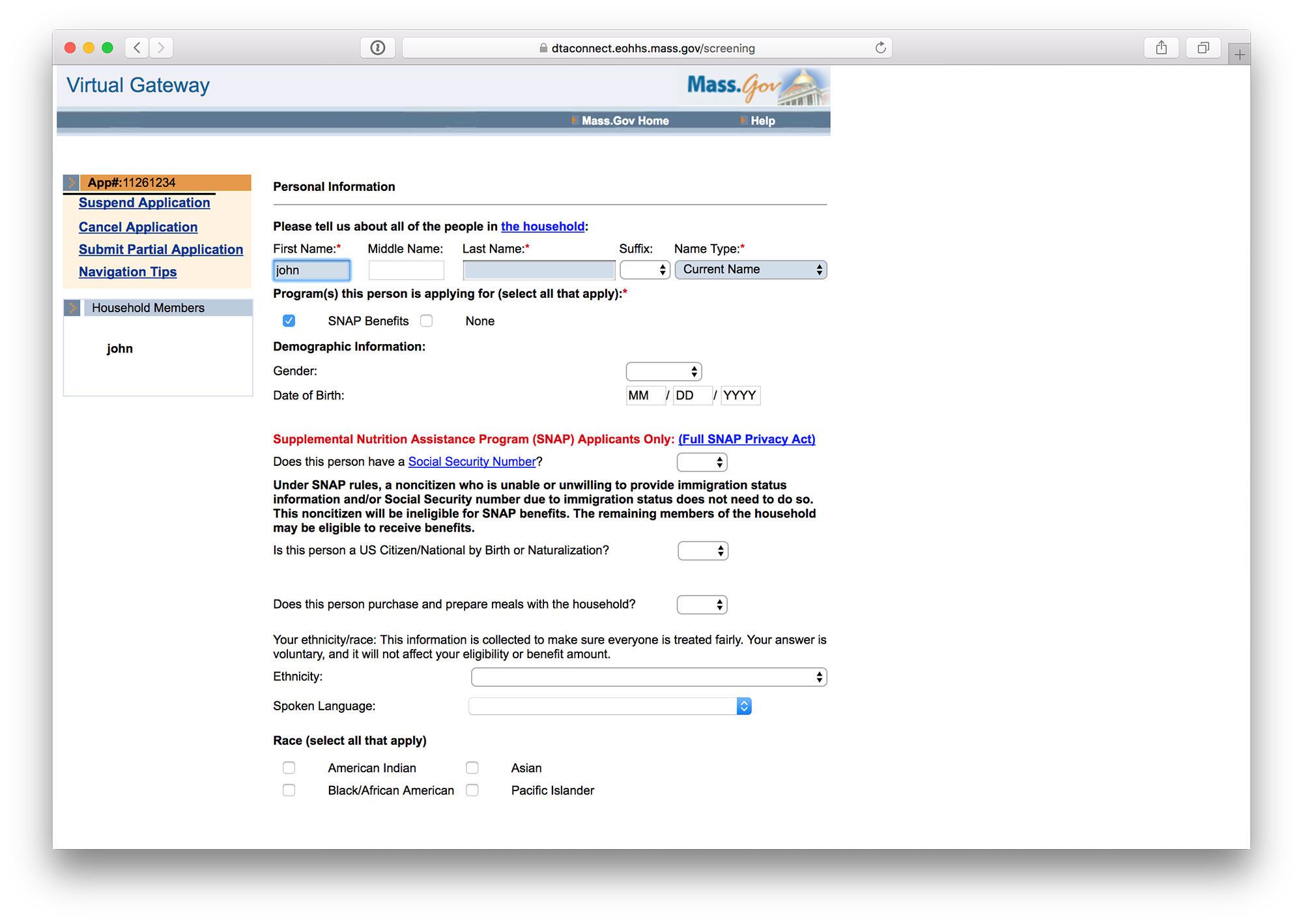
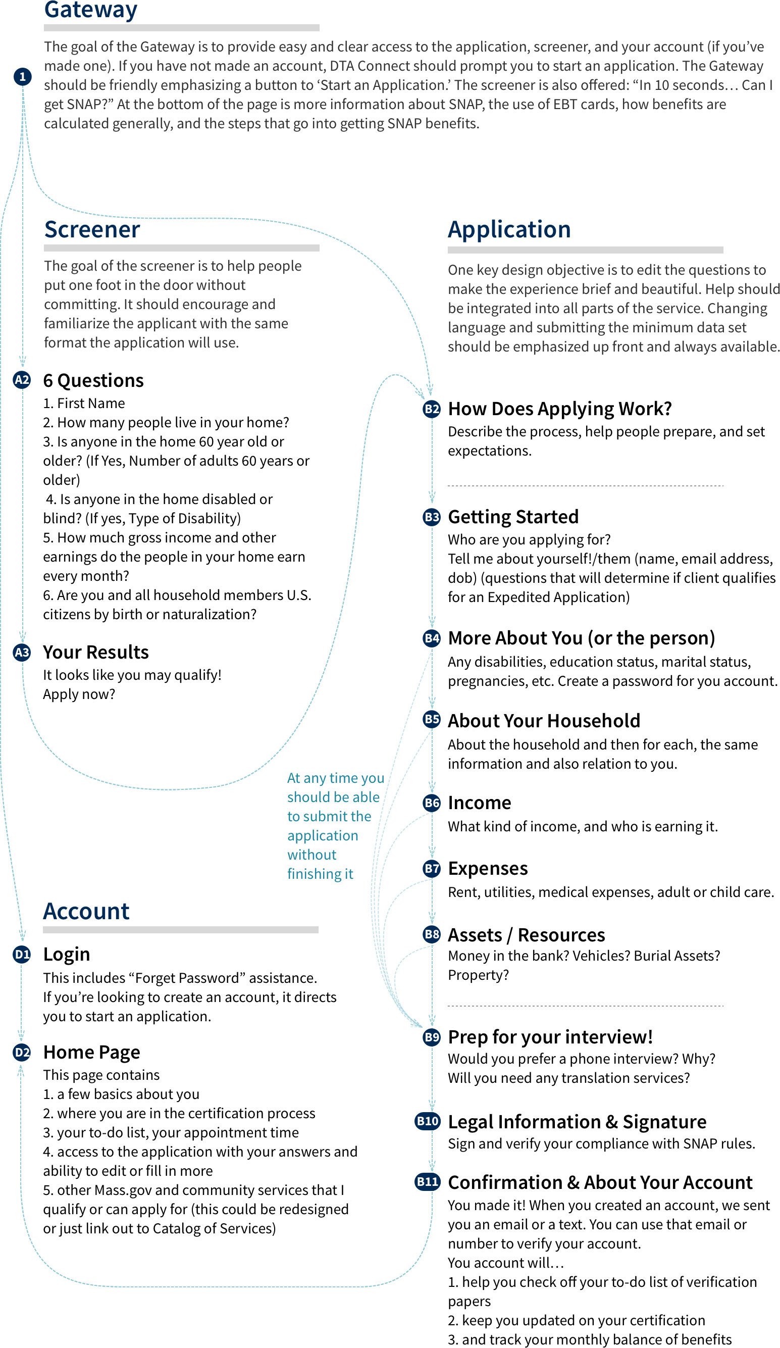
Reaching all people in need is a difficult process, and even when a family has recognized their need and decided to look into options, the application pipeline is time consuming and emotionally taxing. There are three primary steps to receive SNAP benefits; 1. answer questions about your household, 2. perform a phone interview, and 3. submit paperwork to verify your answers. After receiving benefits, the snail-mail and paperwork continues in order to keep the monthly benefits. In 2017, getting past the very first step was dubious, as a two-person family was typically asked 90 questions.
Our project aimed to make this first step welcoming rather than prohibitive through a redesign of the online application. The redesign, conducted by the trio of MA DTA, Conduent, and GoInvo, would focus on a mobile-first + friendly, accessible, quick, and non-intimidating service. Although the application is just one part of the whole, it serves as a key entry way for those in need. The ultimate goal was to increase food security for MA residents by making the SNAP application process accessible and approachable for all.
The outcome was an application that's fully compliant with WCAG and 508 accessibility standards, and currently in use in Massachusetts.
The State of SNAP
Understanding the needs of residents
To reach our users most effectively, we immersed ourselves in information about those applying as well as getting up to speed on the current lay of the SNAP land.
Before the project began, we reached out to a colleague who had been on SNAP as an Americorps teacher (as Americorps teachers are encouraged to do in certain regions). This put a face to the project and shed light on a teacher’s perspective of SNAP. We gathered demographics data and reviewed research about designing government services for those of all language, age, skill, and stress levels.
We reached out to national experts on SNAP policy and civic design for guidance and design feedback. Through Dana Chisnel, Co-Director of Center for Civic Design, the mantra of the design became "linear and literal."
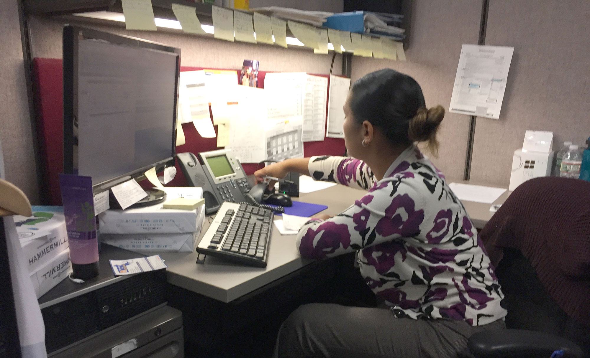
We observed case workers performing phone interviews and assisting applicants and administrators with their paperwork at DTA field offices. We felt the stress, language barriers, and confusion that many applicants had throughout this process, and this drove us to design the application to be as friendly and streamlined as possible.
Simplifying the questions quickly became a priority
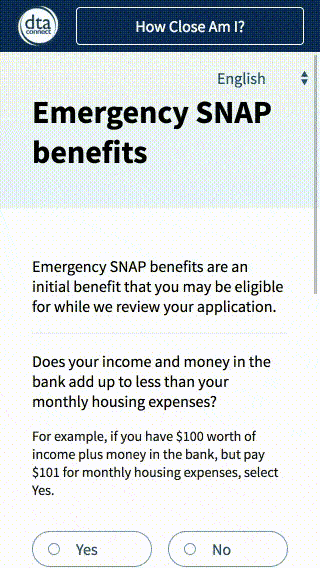
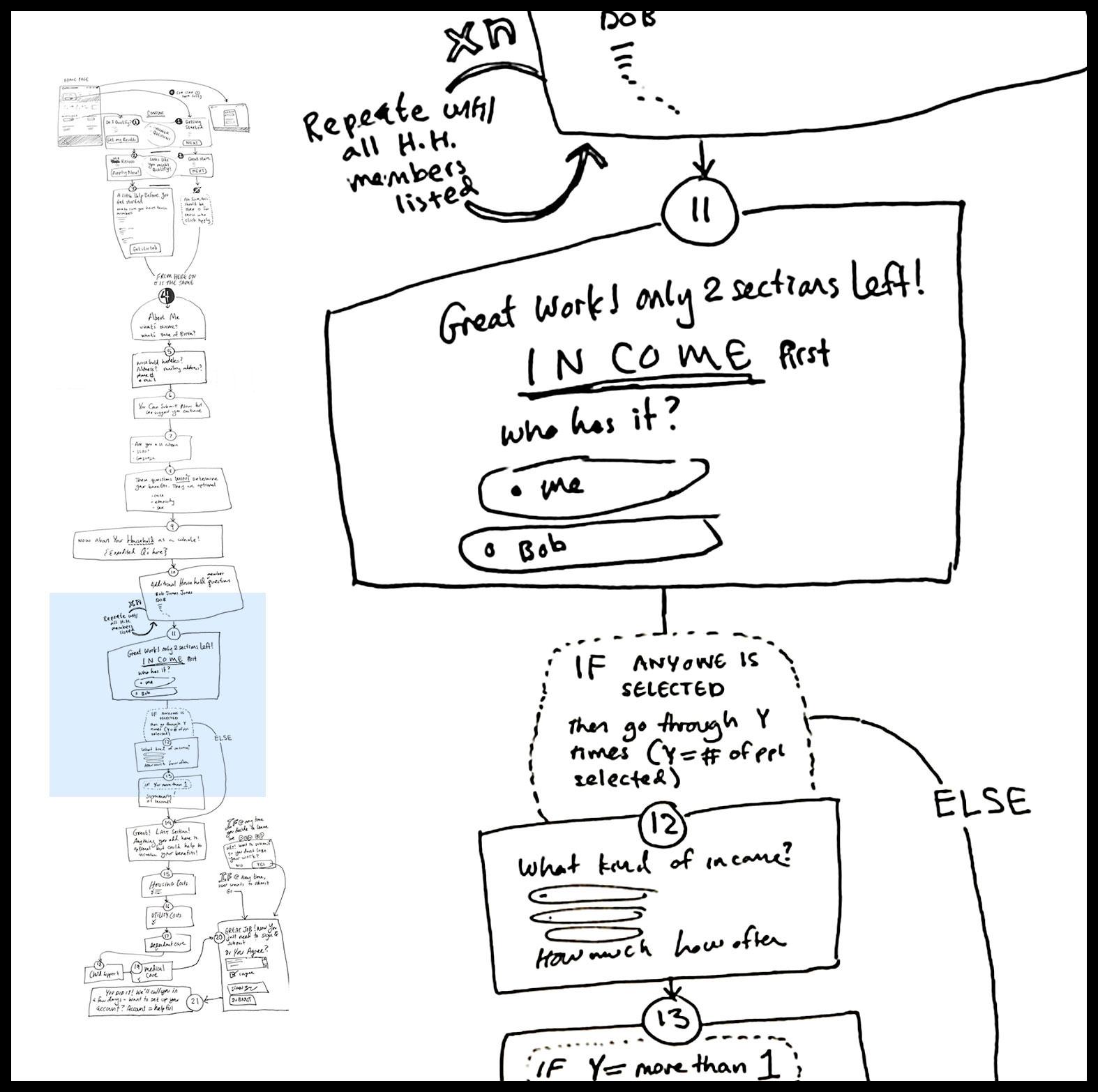
Although we weren't originally tasked with updating the assessment questions, designing the entire experience required us to include language choice and question structure. In working with the SNAP policy team, we dramatically reduced the number of questions from 90 to 40 for a household of 2.
Honing our approach
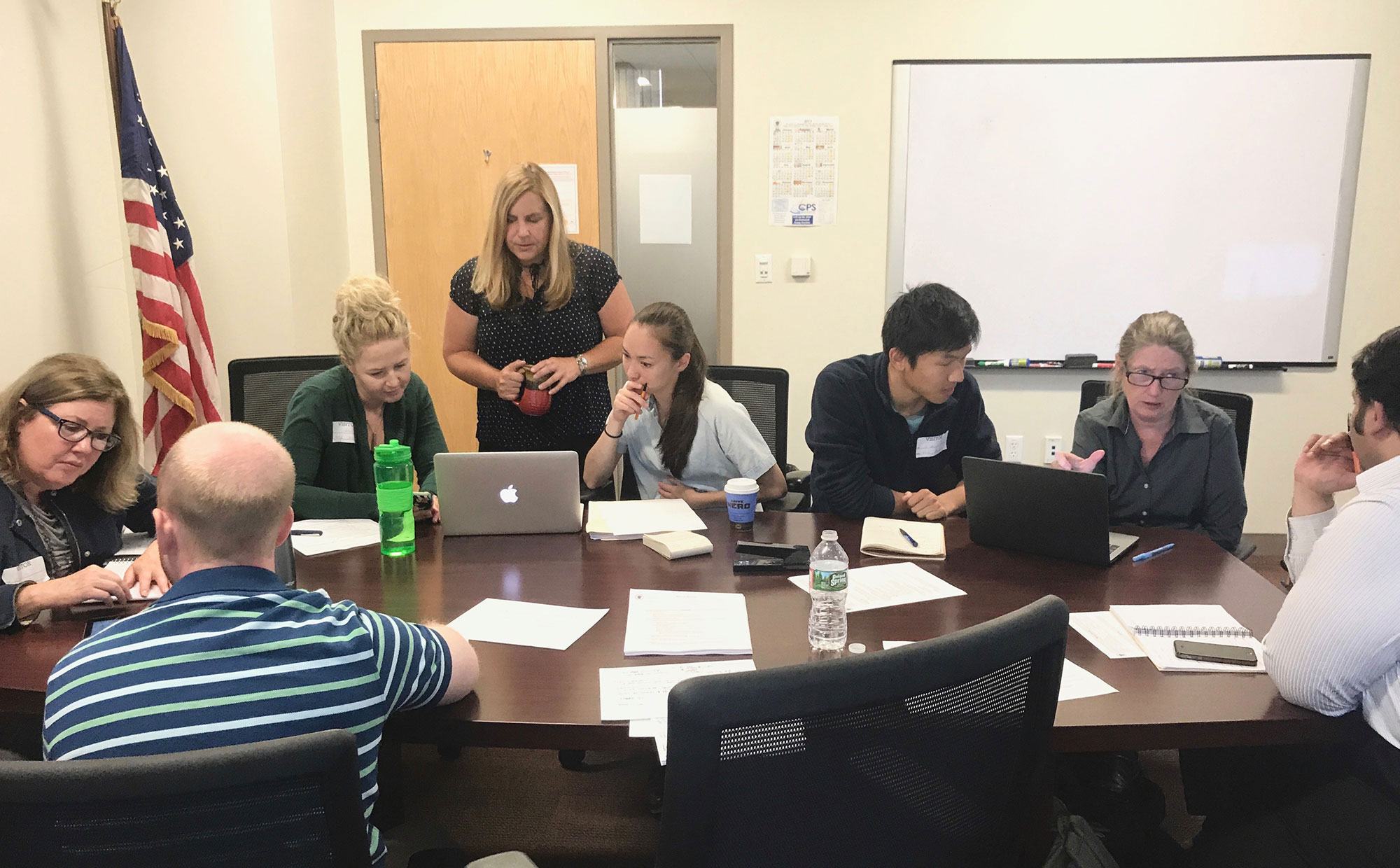
Design isn't just about the final product but also about how you produce it. We needed to get detailed feedback from a diverse set of stakeholders. By building a prototype of the SNAP application design and spending our meeting time in small groups. We brought in laptops, iPads, and mobile phones and gave everyone time to explore the design on their own. We focused on key questions in small groups and sometimes brought handouts to gather feedback from the individual members. This change in strategy propelled the design forward and gave us rich feedback from our client and stakeholders.
Delivering on time
Behavior, interactions, feedback loops, and accessibility standards all manifest in code. In order to communicate how the software should perform, we built a reference implementation of the user interface for our engineering partners at Conduent. We built a fully functioning sandbox in React as well as many of the front end components used in the production environment. Throughout the production cycle, we consulted and QA’ed for the engineering effort, and provided support materials such as outlines for browser and accessibility testing.
The result
Simple and accessible
The design is optimized for screen readers, maintains WCAG 2.0 AAA contrast levels, and allows the user to translate the application. As smart phones are often more readily available than computers, the designed for mobile first, second, and third. The streamlined format minimizes visual burden and reduces missed information.
Reduced question fatigue
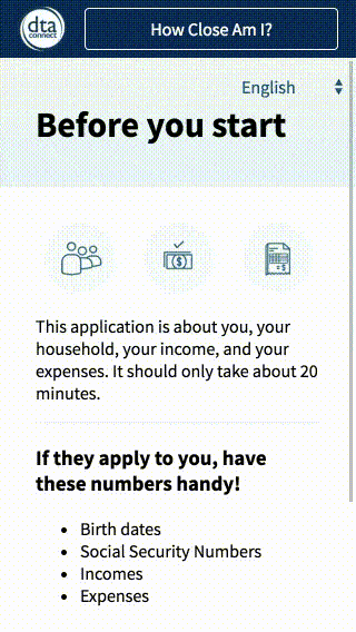
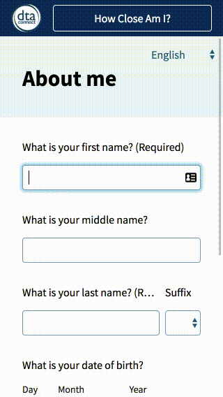
Bite sized sections: Grouping questions by topic into small portions helps users work through the application more efficiently and with less confusion.
Questions decrease from ~90 to 40 for a 2 person household. The redesigned application used logic to continually eliminate questions that were not relevant to the user and avoid duplicate questions.
Contextual help
Diagrams used at the beginning and end of the application help the user expect what comes next. Summaries help the user catch mistakes. Definitions and help text expand inline for easiest reading. The user can track their progress in the menu, as it doubles as a check list.