Microsoft
Results
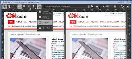
Invo’s redesign transformed one of Expression Web’s key features, Super Preview, from having 60% of the screen being dedicated to UI an affordances to under 10%, all while improving functionality and usability.
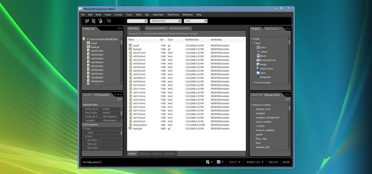
The biggest of Expression Web’s add-ons is the [GoInvo designed] SuperPreview feature.
Digital Arts Online
Details
Robust design and development tool for creative professionals.
- Microsoft wanted to redesign their entire Expression Studio but needed an affordable and “bottom-up” approach
- Invo re-did the key SuperPreview feature with an eye to a new system design
- Worked directly and collaboratively with the Microsoft product and technical leads
- Just 12 weeks for the Super Preview redesign and establishment of design patterns for Microsoft to internally deploy across Expression Studio
Practice Areas
Professional Design Tools
Project Type
UX Strategy & Design
Process
Learning, Envision, Blueprint
Price
$100k – $200k
Have a similar project?
Contact Us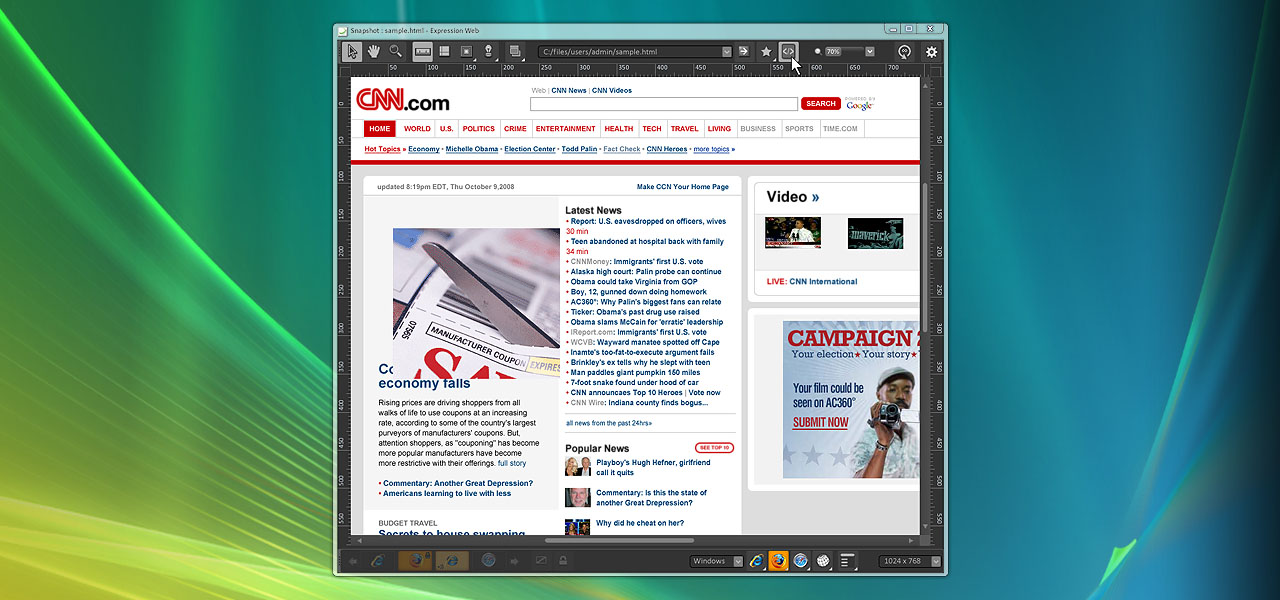
With Expression Studio, Microsoft set off on the challenge to enter the market for software professionals dominated by Adobe. Perhaps not surprisingly, their early versions of the product were not well-received, a combination of the difficulty of fighting Adobe’s dominant market share and the pitfalls and rough edges of releasing a complex new product outside of the company’s competencies. Identifying the interface design as one of the key areas for improvement Microsoft turned to GoInvo.
Microsoft wanted to take a “bottom-up” approach to a full redesign for the launch of Expression Studio 3, having GoInvo design what they expected to be the hottest new feature of the suite, SuperPreview. Microsoft asked GoInvo to redesign this major feature with an eye toward creating design patterns and standards that Microsoft could implement and expand through the entire product.
Buoyed by user research and insight into the complex nature of the problem, GoInvo took the original Microsoft designs for SuperPreview and turned the design philosophy on its head. Recognizing that what users really cared about was their viewable space GoInvo created a smart, tools-based approach to the UI that kept all of the powerful features and functions of SuperPreview easily available, while enabling the user to naturally have 90% of the screen real estate dedicated to their use cases. This distinguished SuperPreview as a premium feature from the first time it was previewed, and helped lead the internal Microsoft team on their broader redesign.
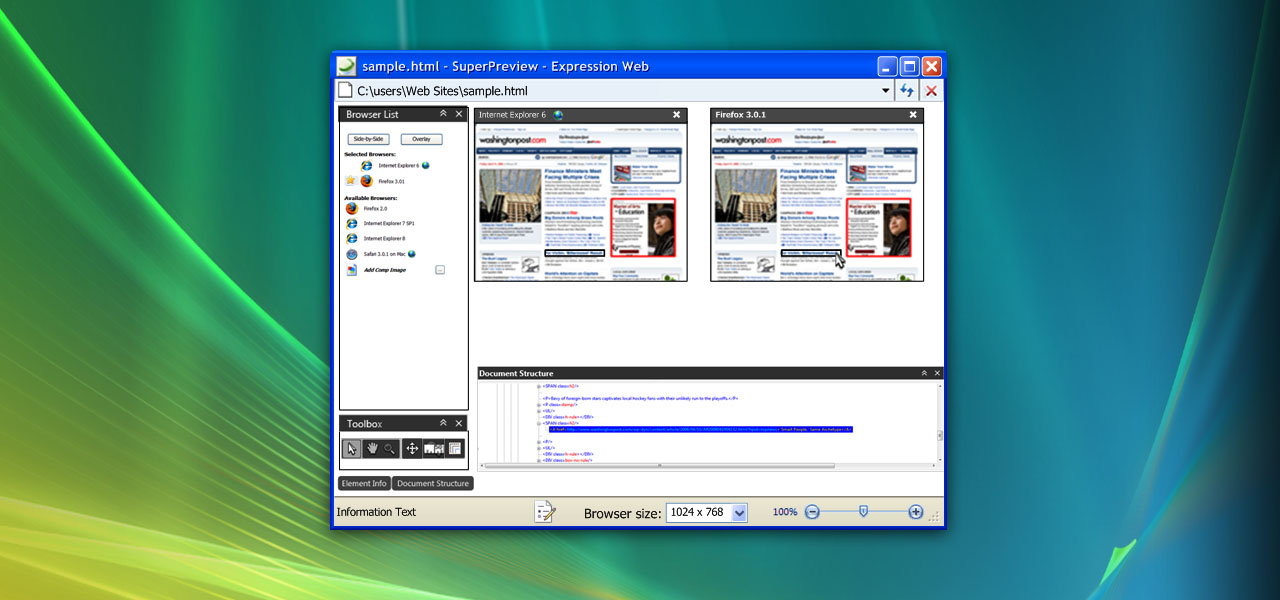
Taking a more traditional UI approach, Microsoft’s original design for SuperPreview was heavy on the tools, light on the workspace.
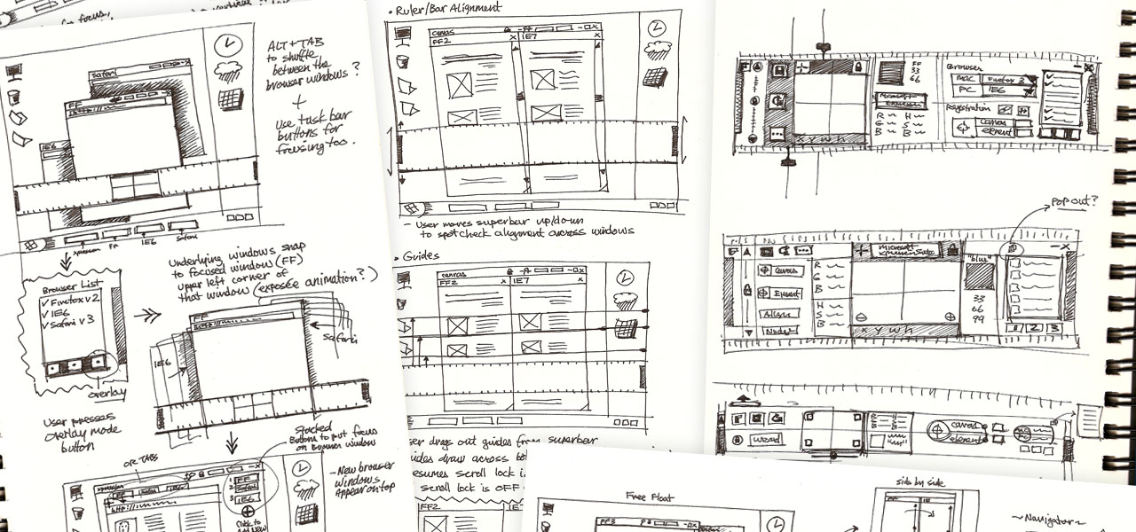
Pencil and paper is the best way to explore ideas and iterate quickly.
With many use cases and screen states to consider we carefully worked through all of the permutations to make a design that worked.
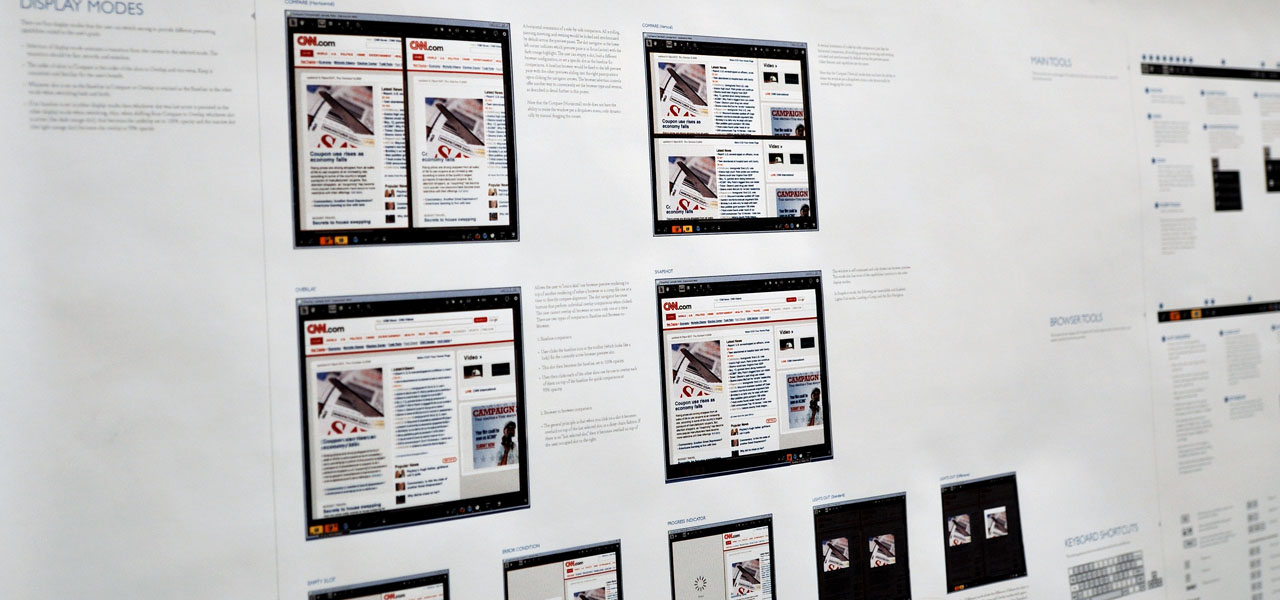
We prototyped the design to validate that the user experience in actual use was exemplary.
The devil is in the details, and the key to this very streamlined-yet-robust interaction model was lovingly crafted, hand-drawn illustrations.
When you add it all together you have an attractive, highly usable and useful app.